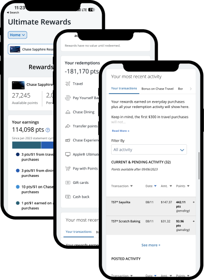
Revamping the mobile rewards experience
To create a more seamless and engaging rewards experience, the Loyalty team of a top-tier financial organization began migrating points-based redemptions to mobile-native, starting with the cashback experiences.
Designers and researchers worked closely with product and marketing teams to revamp the templates, UI elements, and navigation while informing the long-term in-app promotional strategy.
Overview
Organization
My Role
Design Research, UX/UI Strategy, Stakeholder Management
Fortune 50 client
Team
Duration
2 Researchers, 3 Designers
4 Months
The Challenge
Although our client provides premium rewards with high-value points, versatile redemption options, and attractive promotions, cardholders struggle to perceive and take advantage of these benefits. The current experience is hindered by poor design, complex navigation, and ineffective advertising, making it difficult for customers to discover, comprehend, and realize all the value they get. The client has engaged us to identify opportunities for improvement to enhance awareness, increase engagement, and drive conversions.
How might we improve the rewards experience so that customers can easily discover and redeem the full value of their rewards?
Objectives & Key Results (OKRs)
The primary business objective was to drive behavioral change by encouraging dynamic point redemption. This would be achieved by motivating customers to redeem points more frequently and strategically through cost-effective channels while leveraging promotions from merchants.
To achieve this, three key results should be targeted:
How-to spark “dynamic burn”
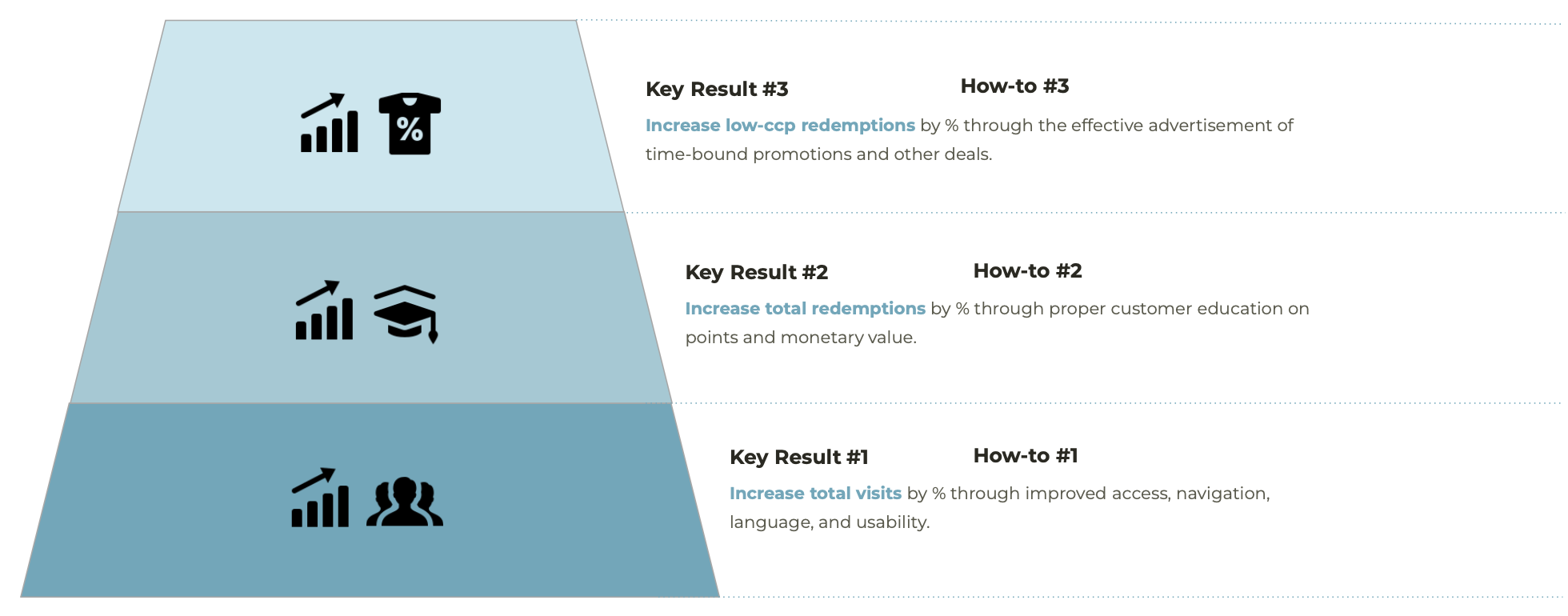
Increase visits and engagement by improving access, navigation, and clarity of information within the app.
Boost total redemptions by educating customers on the value of their points and the various ways to earn and use them, even optimizing their usage.
Encourage low-cost-per-point redemptions by effectively advertising appealing deals and seasonal promotions directly within the app.
The Roadmap
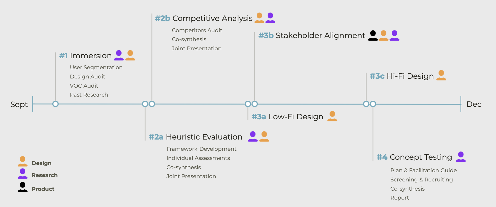
#1 Immersion
To establish a solid foundation and understand the current state, we delved into existing market research and customer feedback.
#2 Heuristics & Competitors
I then led a heuristic assessment using a custom framework aligned with the client’s CX values and trained the team to conduct individual evaluations. After synthesizing our findings, we held a workshop with the client’s design team to align on key themes and best practices. We compiled a deck highlighting design violations and recommendations based on competitor best practices, which we presented to stakeholders.
3# Wireframing
These insights informed design requirements for new concepts, leading to the creation of low-fi screens. We then collaborated with the head of product to finalize the product concepts formulating research questions and hypotheses.
3# RITE Study
Finally, our team conducted in-person concept testing with existing customers, using hi-fi prototypes. The testing took place in the client’s usability labs.
Heuristic Evaluation
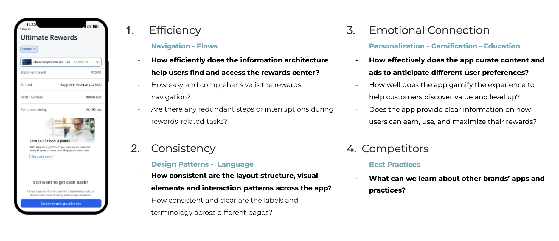
During our heuristic analysis, we evaluated the mobile experience of our client and other competitive or comparative experiences holistically for efficiency, consistency, and emotional connection.
Specifically, we aimed to understand the following:
Learning Objectives & Research Questions
Improvement Opportunities
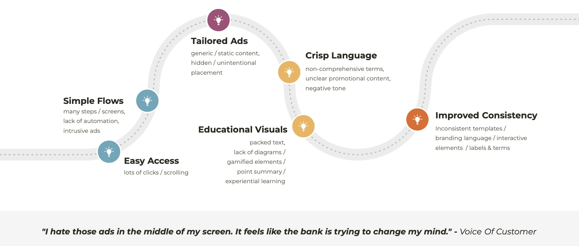
Key needs identified included easier access to rewards, simpler user flows, tailored advertisements, informative visuals, clear language, and improved UI consistency.
Rewards were buried deep in the app's information architecture, requiring multiple clicks to access, while intrusive ads disrupted the flow. Promotional content was perceived as generic and static, with unclear and negatively toned language.
Jobs-To-Be-Done Framework

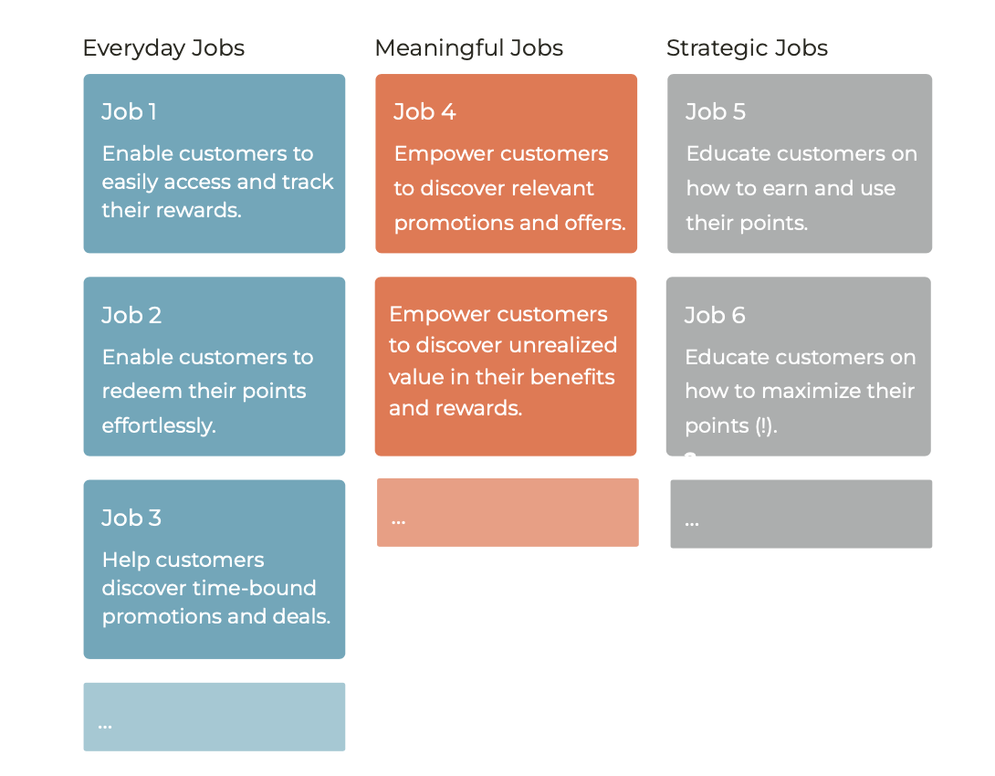
The findings also informed the jobs-to-be-done framework, identifying three key categories: everyday transactional jobs, jobs that foster emotional connections, and jobs that help customers make smart decisions without imposing high costs on the organization. This approach aims to balance business with customer objectives.
Furthermore, the app was text-heavy and lacked visual elements to gamify the experience or integrate educational features such as point summaries, transaction history, and learning resources. Additionally, inconsistent design patterns and visual styles across screens resulted from a hybrid experience.
RITE Study
The insights gathered enabled the team to develop new design concepts and craft research questions tailored to the needs of various stakeholders.
Learning Objectives & Research Questions
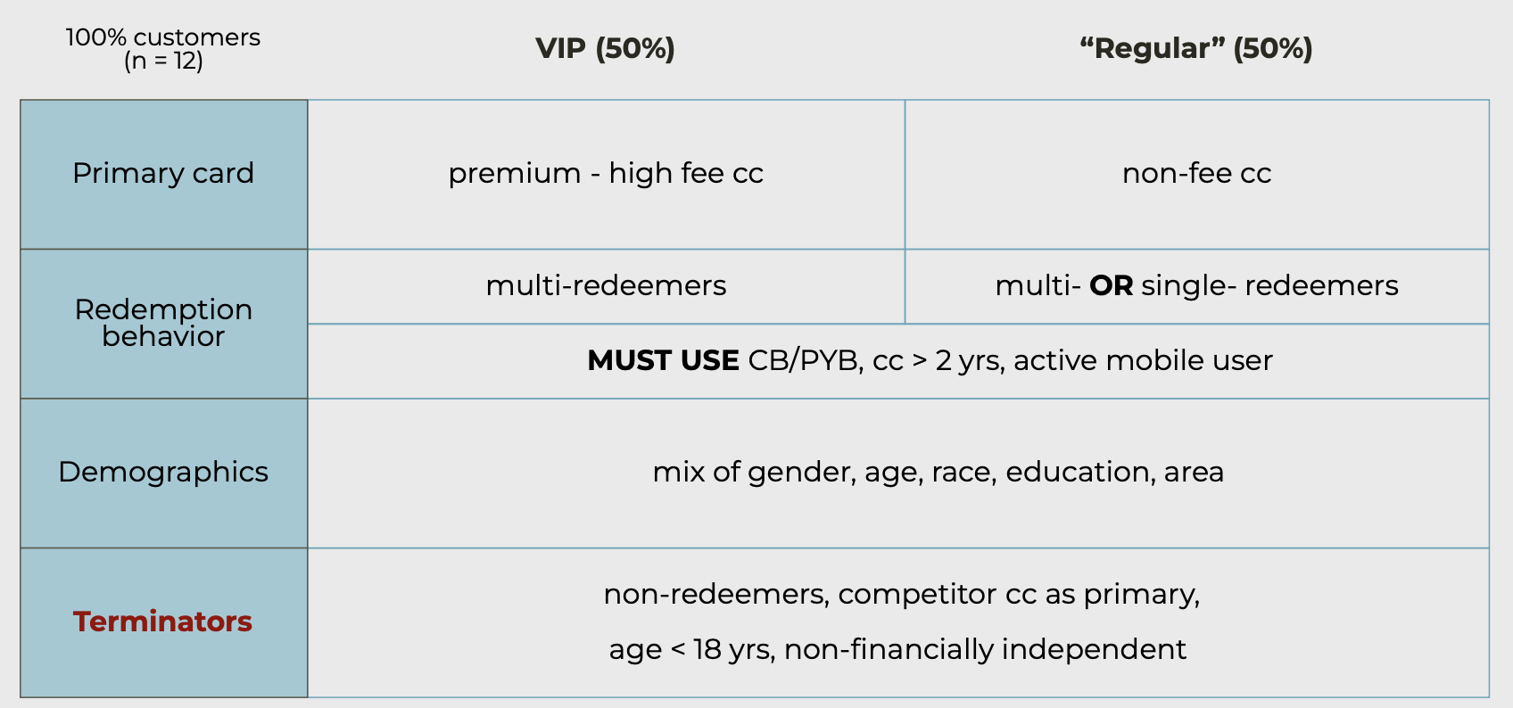
We recruited 12 existing cardholders ensuring a mix of premium and no-fee cards. This approach allowed us to examine regular customers who primarily redeem for cash and VIP customers who frequently engage with promotional content.
Who is (not) an ideal participant?
VIPs are often multi-redeemers, using points for cash, gift cards, travel, and experiences, while single redeemers typically focus on travel or cash. All participants were required to have held their card for at least two years, be active mobile users, and have used cashback options in the past two months.

We sought diversity in gender, race, age, education, and location, excluding anyone under 18, not financially independent, or using a competitor's card as their primary card. Non-redeemers were also excluded due to their lack of experience with points redemptions
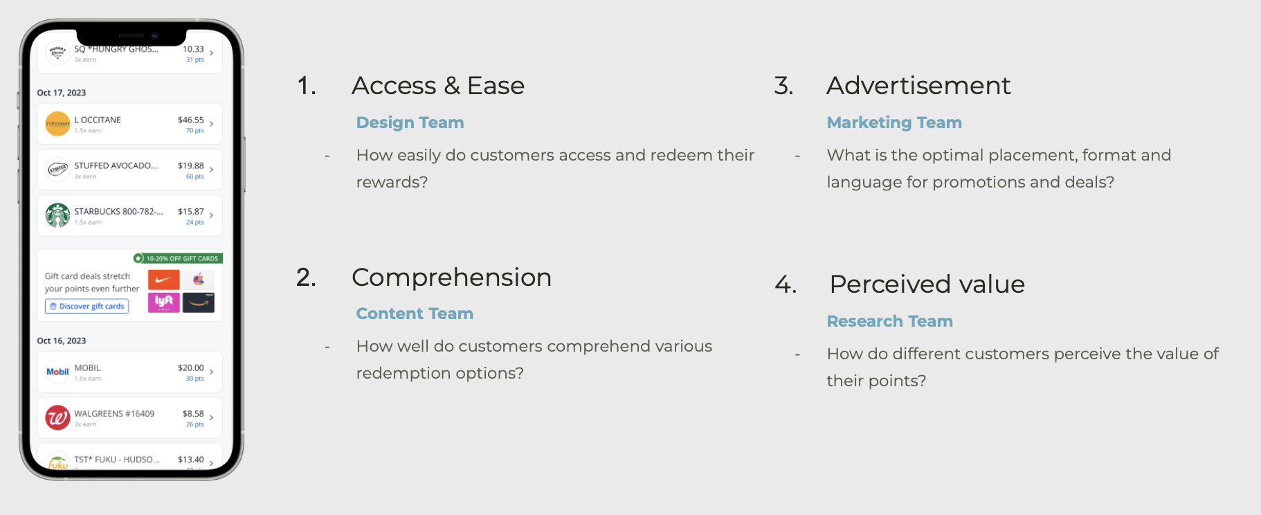
Observations & Recommendations
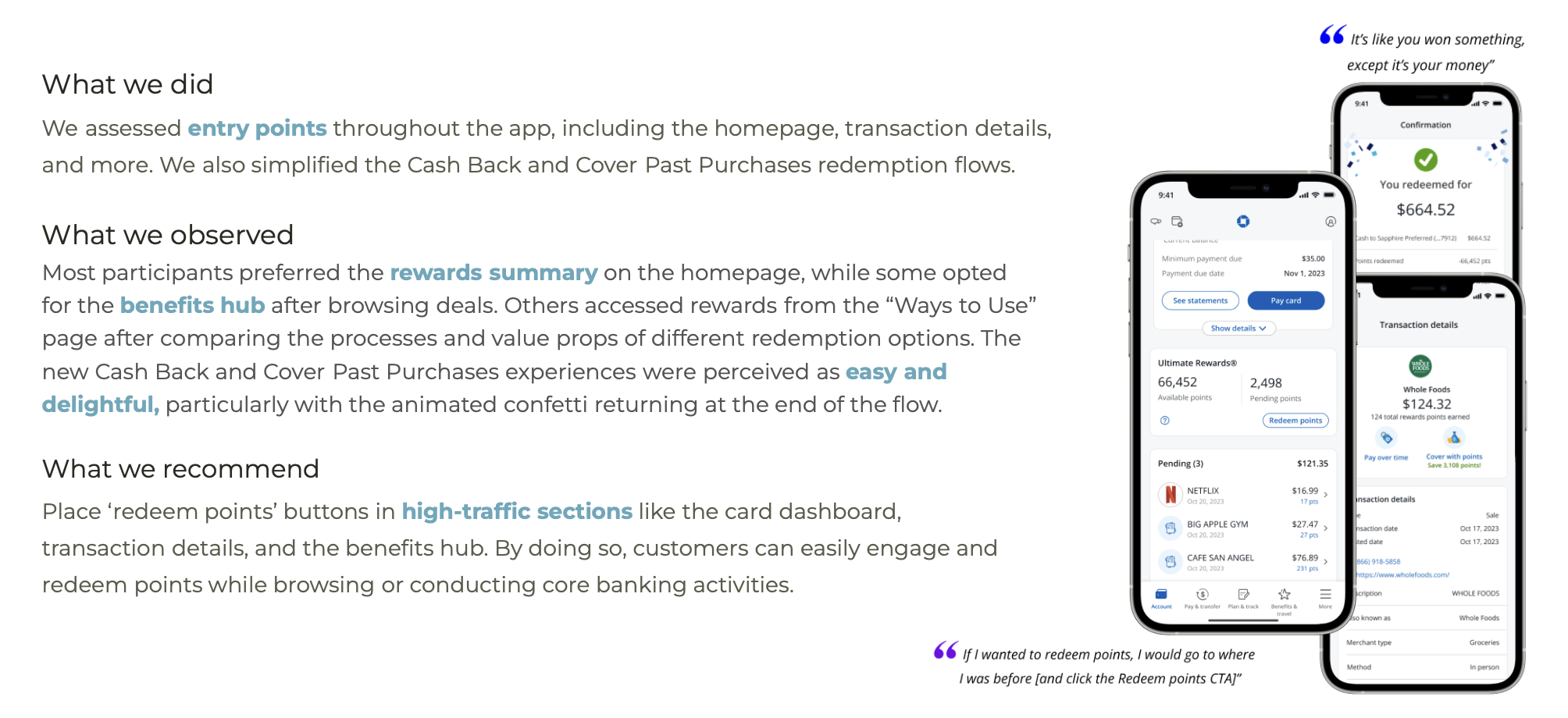
How easily do customers access and redeem their points?

How well do customers comprehend various redemption options?

What is the optimal format for reward promotions?


What is the optimal placement for reward promotions?
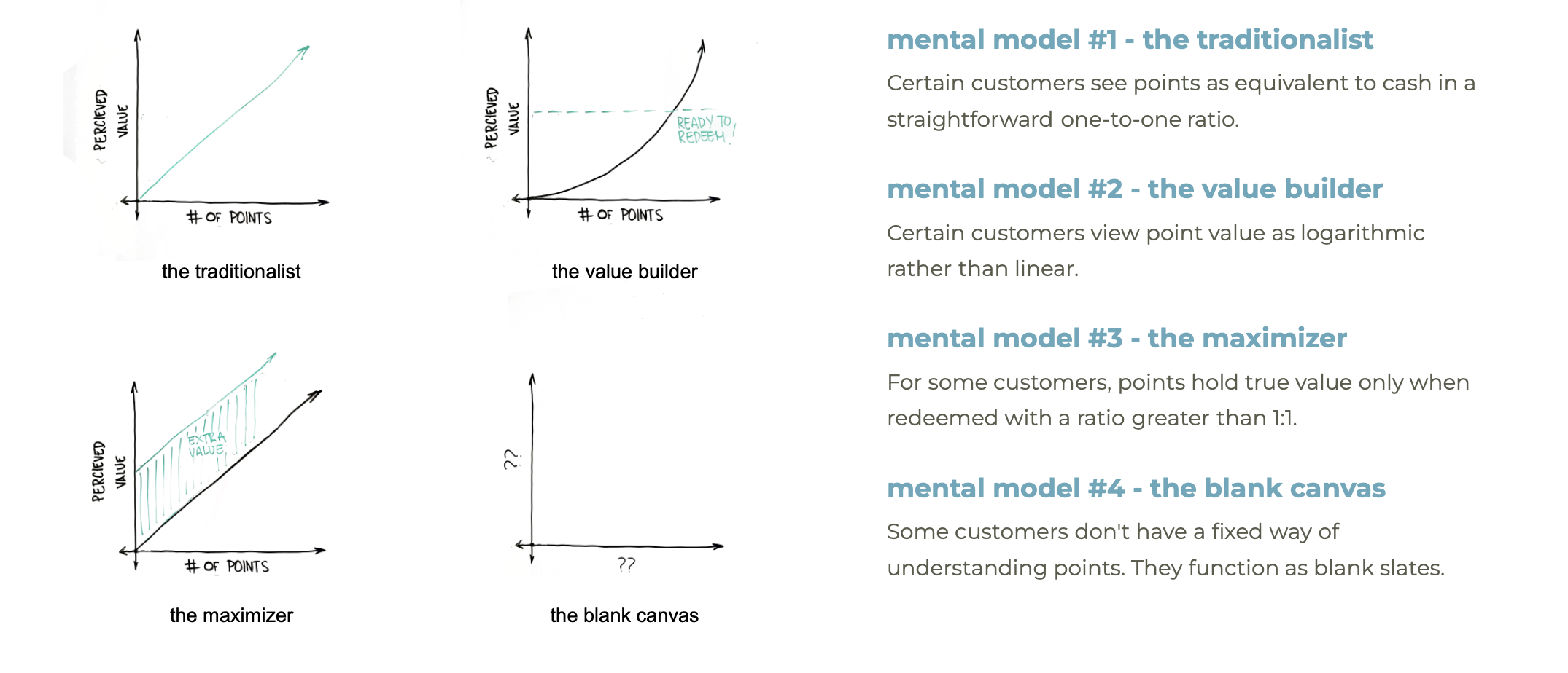
How do different customers perceive the value of their points?
Impact
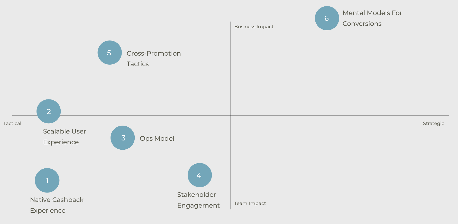
The project had a significant impact on both the team and the business.
First, we successfully migrated the cash-back redemption flow to mobile-native, creating scalable design specifications applicable to all redemption flows.
Second, we established an effective Design & Research ops model mapping out stakeholders, tools, timelines, and key lessons learned.
Third, we successfully engaged stakeholders throughout the project by involving them in research activities, defining objectives, and incorporating their feedback.
Finally, we identified cross-promotion tactics that various teams can use to encourage dynamic point redemption behaviors. By implementing native and educational ads in strategic locations, we saw 30% of participants clicking on ads and opting in, with an additional 20% likely to convert if ads were further personalized to their preferences.
Lessons Learned
Overrecruit by 25%
One key lesson was overrecruiting by 25% to account for potential no-shows, ensuring enough participants to gather meaningful insights.
We found that when targeting a niche audience, it's often better to use a longer screener instead of keeping it short. A more detailed screener allows for more accurate participant selection and includes traps to catch any dishonesty, ensuring higher-quality data.
Screener & Best Practices
Monica’s Rule
Finally, our core stakeholder Monica underscored the importance of creating two variations of a deck or presentation to resolve stakeholder conflicts and align expectations by clearly demonstrating the pros and cons of each approach.